

The word “dashboard” is older than the automobile. In 1846, it meant a board, sometimes a leather apron, that was fixed to the front of a horse-drawn carriage. Its job was to simply stop the mud that the horses’ hooves dashed up from hitting the people in the seat. Of course, it carried no gauges and no dials. It was just protection, not a display piece. In fact, the first mass-produced car in history, the Oldsmobile Curved Dash of 1901, was literally named after this mud shield. When engines moved to the front of the car in the early 1900s, the same board became a barrier against heat and oil. Since it was a flat panel sitting directly in front of the driver, manufacturers began mounting gauges on it. That’s it. As the etymologists put it, apart from its position in front of the seat, the modern dashboard has almost nothing in common with the original.
I have spent years building and using business dashboards, probably from every seat at the table. I owned the BI function for an entire organization, serving seven business units at the same time. I have built executive dashboards for leadership consumption and operational dashboards for day-to-day work. Now, while building AI systems, I see the dashboard is still the most in-demand artifact. When people describe what they want built, it is the first thing they name. My conclusion, from all of this, is straightforward: most enterprise dashboards are still just the shield on which the charts are mounted. The underlying function, though, is protection for the people above and the people below. Once you see that, you don’t get surprised by the adoption numbers, whichever way they turn out. You can also see clearly what the dashboard is going to look like in the era of AI.
The promise, in its own words
The dashboard’s intellectual history, interestingly, begins with a complaint. In 1961, D. Ronald Daniel of McKinsey published an article in Harvard Business Review titled “Management Information Crisis.” He flagged that companies were drowning in reports and starving for relevance at that time. For a long time, this continued to be a problem, until 1979, when John Rockart of MIT Sloan published “Chief Executives Define Their Own Data Needs” and formalized the idea of critical success factors.
If you read Rockart today, it’s striking how narrow the doctrine was. Executives should track a small number of areas where things cannot go wrong, and those areas should be defined by the executives who have to act, through structured interviews, one decision maker at a time.
In today’s world, both halves of that doctrine have been inverted. A small number of metrics grew to become dozens, and what was defined by the decision maker became defined by whoever was building the artifact. In that sense, the founding literature of this field would fail almost any executive dashboard in production today in a design review.
The first generation of software that was built on Rockart’s idea, called executive information systems, died quickly in the 1980s. The reason was that the information feeding those systems was incomplete, unreliable, and scattered across too many sources. Read that again, because that’s a description from the early 1990s, and it’s also a description of what today’s data quality review would tell you.
There is a supporting detail from the same era. A field study of 43 organizations listed the two major problems in developing these systems: getting accurate data and identifying executives’ information requirements. That is 1995, stating the entire thesis of this article.
The same study had one more number worth noting: the average cost of a first executive information system was roughly $325,000 in early 1990s money, which covered hardware, software, developers, and the cost of training. That is roughly three-quarters of a million dollars in today’s worth, for one system. At that price, you needed an executive to sponsor it and a key decision to be identified and committed to. This was not governance. This was basically a purchase order, which had a governance function built in. And this was also the thing which every later wave removed.
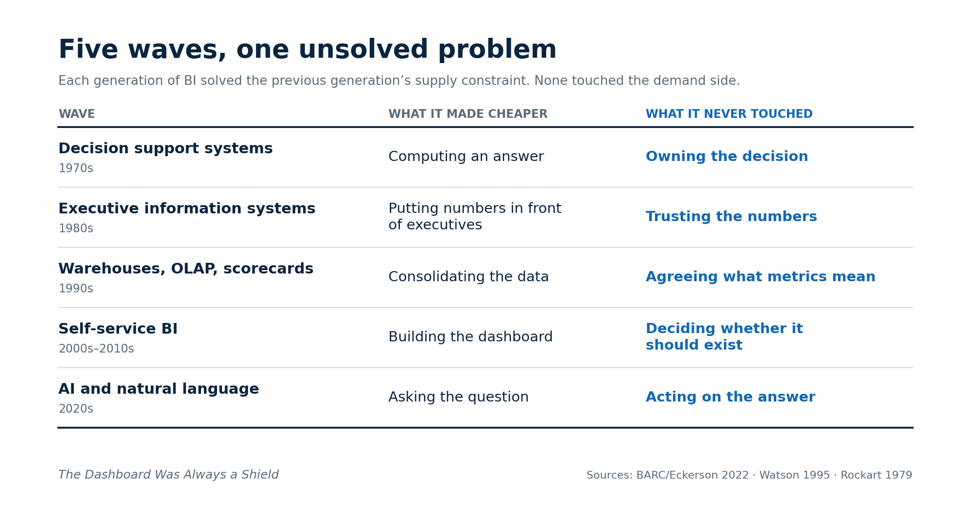
Five waves, one unsolved problem
The world of dashboards has evolved a couple of times in the past, in waves and waves of generations, and each generation of this technology solved the previous generation’s supply constraint. However, none of them touched the demand side.
The scoreboard for this forty-year effort comes from BARC and Eckerson Group, who surveyed 214 leaders in the field of data and analytics in 2022. They summarized in their finding that only a quarter of the employees actively use the BI tools their company pays for. They also found minimal growth across the seven years they tracked the metric. These seven years cover the entire self-service era. That generation was supposed to fix adoption, but it did not happen as expected.
Coming back to the number: a quarter of the seats actively used. That number has a widely repeated cousin, a figure commonly attributed to Gartner, saying 60 to 70 percent of dashboards go unused. I was not able to trace that figure to any Gartner publication, so it appears it originated from social media posts. The 25 percent figure, the one with a survey behind it, is still the critical one.
What a dashboard is actually for
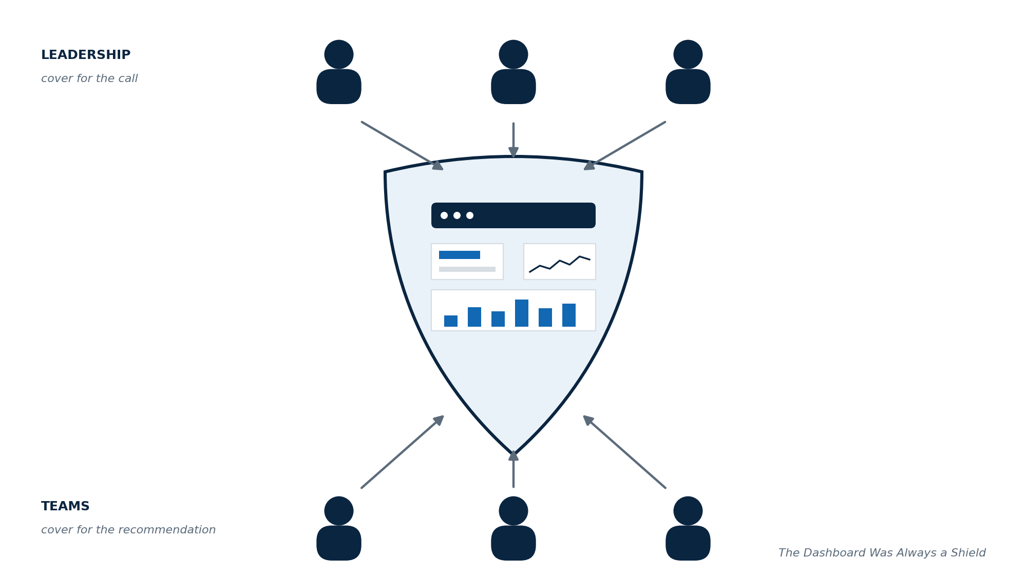
So, why does this heavily unused artifact keep getting built without any signs of slowing down? The reason boils down to this: the dashboard is not primarily serving the decision. Its main job is to serve the relationship between the people above the decision and the people below it. Leaders often ask for more data because data is a cover for a call they will be held to, and teams happily supply more data because data is a cover for a recommendation they will be held to. Both sides are behaving rationally. In that sense, the dashboard is where both parties deposit their insurance, and it grows for the same reason insurance policies grow.
To be fair, I approved a lot of that growth myself. Every leadership dashboard that I have been responsible for almost always started with a clear question but then ended up as a negotiation. There was always one more panel requested from a stakeholder, which sounded reasonable, and I happily signed on to most of them. As a result, within a few quarters, the artifact became an information-bloated report with decisions somewhere buried inside it. As expected, people stopped opening it to decide anything. Rather, they opened it to retrieve a number whenever someone asked them a question. In short, it had become a proxy for the database, with a colorful UI and better fonts.
If we look at it, the plot twist is that the artifact is working as designed. It just was never designed for what its name says.
There is an easier way to understand this: most enterprise dashboards are, in fact, simply an alignment artifact, though they are sold internally as decision systems. The alignment function is real and legitimate, because organizations genuinely need one place where everyone can look at the same uncontested number to move forward. It’s also true that nobody is going to fund a $2 million alignment artifact. That is why it gets pitched as a decision system, and then we are surprised when only a few decisions trace back to it.
There is a category of dashboards where it demonstrably works: operational dashboards. It’s the kind you have seen, which watches a production line or an on-call queue. They succeed because they meet four conditions by construction:
one type of user
one class of decisions
one owner
a threshold that determines the action
Even Gartner, whose recent conference sessions carry catchy titles like “Are Dashboards Dead?”, acknowledges plainly that dashboards remain the backbone of enterprise analytics for operational oversight. The earliest dashboard I remember building ran on exactly this pattern, for my own team, and it worked because it was clear who was going to look at it and what action they needed to follow. Dashboard failure is usually concentrated at the strategic tier, where none of the four conditions hold together.
What AI eats, and what it cannot
With execution happening at an ever-faster rate, where we are building dashboards by the hour, the common worry is that AI will flood organizations with these generated dashboards. To be honest, this is going to happen, but I think, on the surface, it misses the deeper change. For forty years, the real governor on dashboard proliferation was the cost of a human builder. When a dashboard cost three-quarters of a million dollars in the nineties, or six weeks of a scarce analyst’s time until recently, someone needed to build a case and argue for it, and that business case was the prioritization bar. Now, with AI, since the build cost is plummeting to zero, it effectively means the last containment mechanism is gone. Just to be clear, AI did not create the dashboard problem. It was already happening. What it did was remove the only thing that was holding it in check.
In reality, AI is actually splitting the dashboard into two separate functions and treating them very differently:
The lookup function: that’s the proxy-to-the-database use case, which dominates real dashboard traffic. That’s the one which AI is genuinely eating. The capability jump here is real. In late 2024, the best models solved under 20 percent of tasks on Spider 2.0, a benchmark built from genuinely messy enterprise databases. By 2026, agentic systems on the public leaderboard clear 90 percent, with the caveat that benchmarks come with prepared documentation that production schemas rarely have. Directionally, though, it means nobody should have to navigate to a page to retrieve a number. They could simply ask for it. That use case is clearly ending, and rightly so.
The decision function: this one is different because it runs on something AI cannot generate, which is agreement on definitions. Every organization that I have worked in carried multiple live definitions of its most important metrics. When I owned the BI function, reconciling two versions of the same number consumed real time in almost every senior review. Sometimes, a dashboard ran up to six months just to get the alignment done before anybody saw an action out of it. Any project to standardize the definitions properly was always too long and too political to survive a budget cycle. That trade-off made sense when humans read those numbers, because a human spotting a mismatch in the quarterly reviews creates friction and a potential delay, but nothing worse. However, the moment software agents act on the numbers instead of humans reading them, that trade-off inverts. In simpler terms, a wrong revenue definition a person catches turns into an argument, but the same definition consumed by an agent that writes back to the system turns into a liability.
The industry has noticed. In January 2026, an open specification for semantic interoperability reached version 1.0 with dbt Labs, Snowflake, Databricks, and Microsoft behind it, and Snowflake shipped governed semantic views to general availability in the same quarter. Note what happened: four competing platforms converging on the same unglamorous problem inside a single quarter. Now that’s a signal. The standardization work that was never worth the ROI just became the prerequisite for the entire agentic roadmap. Gartner’s caution belongs next to that signal. They predict over 40 percent of agentic AI projects will be canceled by the end of 2027, citing escalating costs, unclear business value, and inadequate risk controls.
The bill
Now let’s put the economics in one place.
Enterprises currently spend somewhere between $35 billion and $44 billion a year on BI, depending on which analyst is counting. Inside that, roughly a quarter of licensed employees are actively using it, a figure that has stayed flat for seven years. Confidence is moving the wrong way as well. A Salesforce survey of 552 American business decision-makers in March 2025 found confidence in data accuracy down 27 percent from its 2023 benchmark.
Against this, the industry is also citing strong returns: around $9 back per dollar spent, in recent Nucleus Research figures. On the face of it, these numbers look contradictory, but actually they are measuring different populations. The ROI studies are built from case studies of deployments that have worked. Return is measured on the survivors, whereas adoption is measured on everyone.
I have never seen a portfolio review inside a company that prices this gap, and I myself ran a function that should have run one.
What survives
The lookup dashboards are going to meet their natural death sooner than most expected, and so does the omnibus organization-level dashboard built by committee, which only ever existed because building was so expensive. The expense forced everyone’s requests into one project. When the build cost collapses, the consolidation logic collapses with it. So, uncomfortably, does the analyst role whose core skill is assembling charts.
Three things survive:
Operational closed-loop dashboards, which get better as AI handles the watching.
The shared-reality artifact: the one canonical screen a leadership team argues in front of, which survives precisely when it stops pretending to be a decision system.
The audited dashboards in regulated settings, where the artifact is the evidence trail.
Two things emerge as well:
The semantic layer becomes the actual product, with dashboards demoted to views on top of it, because agents do not need visualization; they need definitions.
The dashboard’s successor is an interface, probably an approval queue: “Here is what the agent is about to do. Here is the number it rests on. Here is where that number came from. Your call: approve or reject.”
Notice that, unlike the older versions, this interface has an accountable owner built into its very shape. That points to the test I would apply before building anything in this category now. Four fields:
The decision this serves
The person who makes it
The cadence they make it on
The threshold that triggers action
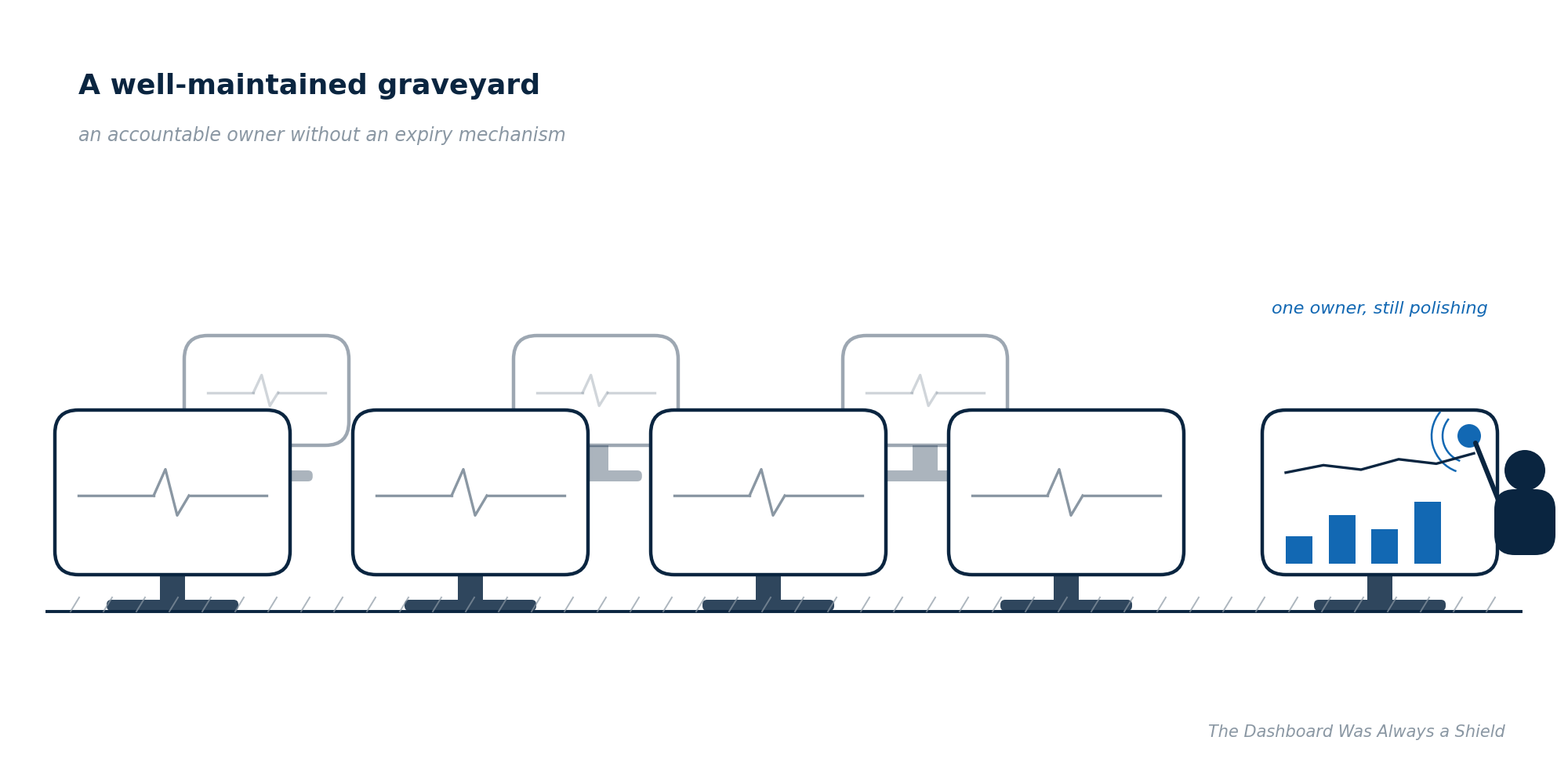
If you cannot fill all four, you’re just building a reference table, and that is fine. Just do not put one in the QBR and call it decision support. Give every dashboard an expiry date with a renewal condition. If its owner cannot name a decision it changed this quarter, or at max two quarters, archive it. An accountable owner without an expiry mechanism just produces a well-maintained graveyard.
The charts were never the durable part. Every wave of this technology rebuilt the display layer, and every wave inherited the same unresolved questions underneath: what the metrics mean and who acts on them. Those two things have held their value since Rockart wrote them down in 1979. Everything mounted on top has been replaced five times already. The mud is about to fly faster than it ever has. It’s time to check what your board is actually protecting.
Sources
Etymonline, “dashboard”: https://www.etymonline.com/word/dashboard
Oldsmobile Curved Dash, 1901, first mass-produced automobile (standard historical account)
Daniel, “Management Information Crisis,” Harvard Business Review, Sept–Oct 1961
Rockart, “Chief Executives Define Their Own Data Needs,” Harvard Business Review, March 1979
Stephen Few, Information Dashboard Design (2006) — EIS failure account
Watson, “Development practices for executive information systems: findings of a field study,” Decision Support Systems 14(2), 1995, pp. 171–184 (43 organizations; $325,000 average cost; two major problems finding)
BARC/Eckerson, “Strategies for Driving Adoption and Usage with BI and Analytics,” 2022, n=214: https://barc.com/news/new-study-identifies-drivers-of-bi-and-analytics-adoption-in-companies-today/
Salesforce/Tableau “Insight vs. Instinct,” March 2025, n=552
Spider 2.0 (Lei et al., ICLR 2025) + leaderboard: https://spider2-sql.github.io/
Open Semantic Interchange v1.0, January 2026
Gartner press release, agentic AI project cancellations, June 2025: https://www.gartner.com/en/newsroom/press-releases/2025-06-25-gartner-predicts-over-40-percent-of-agentic-ai-projects-will-be-canceled-by-end-of-2027
Gartner Data & Analytics Summit 2026 session, “The Future of Dashboards”
Nucleus Research analytics ROI (~$9.01 per $1, case-study based)